What is a Histogram?
A histogram is “a representation of a frequency distribution by means of rectangles whose widths represent class intervals and whose areas are proportional to the corresponding frequencies.”
Online Webster’s Dictionary
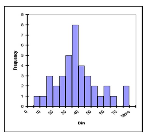
Sounds complicated . . . but the concept really is pretty simple. We graph groups of numbers according to how often they appear. Thus if we have the set {1,2,2,3,3,3,3,4,4,5,6}, we can graph them like this:
This graph is pretty easy to make and gives us some useful data about the set. For example, the graph peaks at 3, which is also the median and the mode of the set. The mean of the set is 3.27—also not far from the peak. The shape of the graph gives us an idea of how the numbers in the set are distributed about the mean; the distribution of this graph is wide compared to size of the peak, indicating that values in the set are only loosely bunched around the mean.
The purpose of the histogram are as follows.
①You can see visually the status of the distribution
②You can see the average value and variance
③I can see the shape of distribution.
analysis procedure by Histogram
①Purpose:
・Start after you understand the purpose.
・Start after coordination with the relevant departments
②Sampling:
・Random sampling
・Check the sampling work at Site
③Measurement
・Fill purpose, method of measurement, the number, the expiration date
and Passed on to the person in charge of measuring
・Check theMeasureing work at Site
④Start Excel and Open the file name” frequency distribution table”
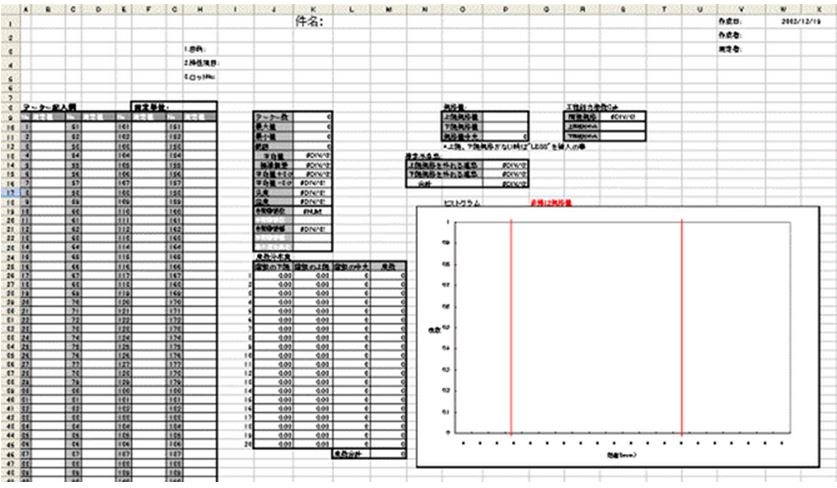
⑤Fill in the subject, purpose, characteristics of the item, lot
⑥Enter Data
・Enter the measurement data at hand.
*Basic statistics are automatically updated. (Number of data, maximum minimum, etc
・Enter the unit of measure
⑦Creating a frequency distribution table
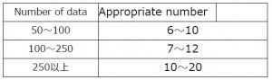
・Number of class:Enter the number of class to reference the value of automatic calculation
Automatic calculation value calculated from the “official of Sturges.”
⑧Understanding of process capability index
・Standard upper and lower standard:Fill lower and upper limit standard standard
・Only lower standard:Enter the “LESS” at maximum standards, then enter a value lower standard.
・Onlyupper standard:Enter the “LESS” at minimum standards, then enter a value upper standard.
・Cpk process capability index is automatically calculated
⑨Fill in the standard value
・Enter upper and lower standard value line in the histogram
Because you can understand at a glance the status of the process
⑩Enter the results
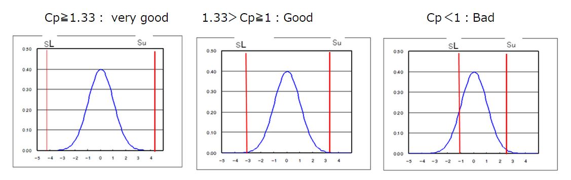
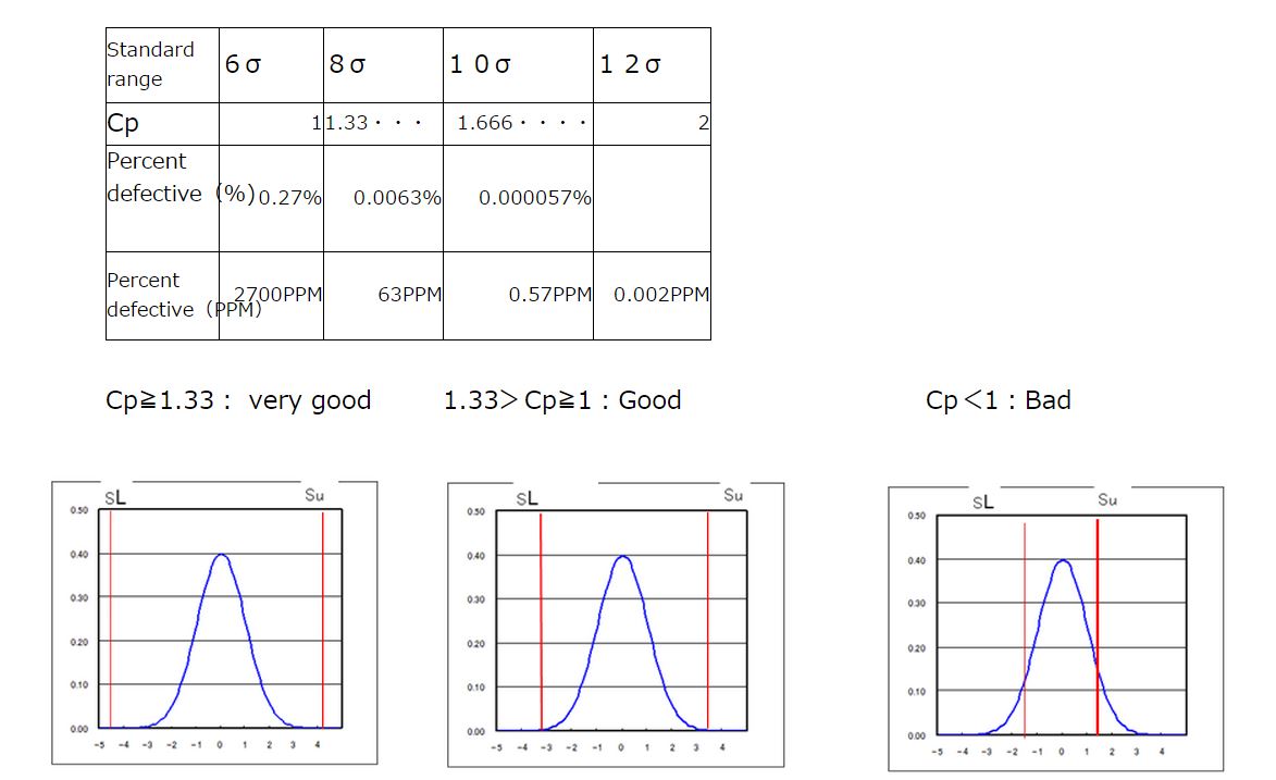
・What is the status of the process capability index?
Cp≧1.33: very good 1.33>Cp≧1: Good Cp<1:Bad
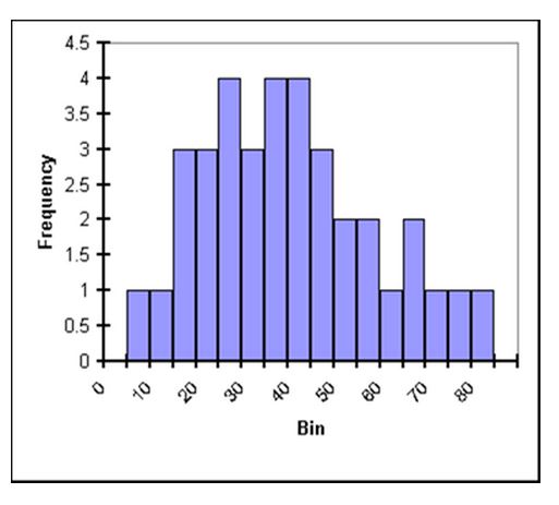
This plot represents data with a well-defined peak that is close in value to the median and the mean. While there are “outlyers,” they are of relatively low frequency. Thus it can be said that deviations in this data group from the mean are of low frequency. If this were a mass plot in particle physics, we’d say the mass is understood with good precision.

In this plot the peak is still fairly close to the median and the mean, but it is much less defined. It is harder to tell from the plot what the exact location of the peak is. There are almost as many values close to the peak as at the peak itself and outlyers are frequent. As a particle physics mass plot, this gives an imprecise and uncertain mass of a particle.
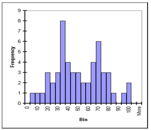
Where are the median and the mean? It is hard to tell; it also may not be relevant. There are two peaks in this plot: a taller primary peak as well as a shorter secondary peak. This could indicate either very poor definition of one signal in the data or, more likely, two signals. In particle physics, this could show two separate particles or, as is often the case, a large signal with “background” particles and a smaller signal (sometimes very small), called a “bump,” which shows the actual particle under study.
*Quote From ”http://quarknet.fnal.gov/toolkits/ati/histograms.html”
Description of the process capability index
In process improvement efforts, the process capability index or process capability ratio is a statistical measure of process capability: the ability of a process to produce output within specification limits.[1] The concept of process capability only holds meaning for processes that are in a state of statistical control. Process capability indices measure how much “natural variation” a process experiences relative to its specification limits and allows different processes to be compared with respect to how well an organization controls them.
If the upper and lower specification limits of the process are USL and LSL, the target process mean is T, the estimated mean of the process is \hat{\mu} and the estimated variability of the process (expressed as a standard deviation) is \hat{\sigma}, then commonly-accepted process capability indices include:
What is Cp?
If we divide Standard Width by 6σ We get Cp
6σ is sixfold standard deviation
Usually Cp is the process capability index
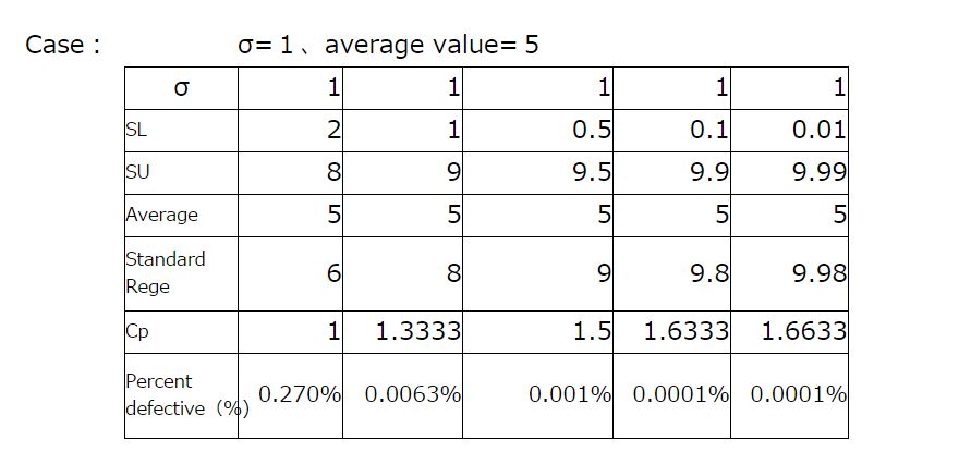
This formula is is applied when average value and Median of standard value equal
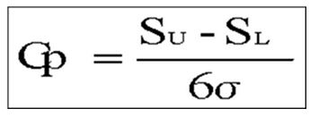 Standard Upper :Su
Standard Low:SL
σ:Standard deviation
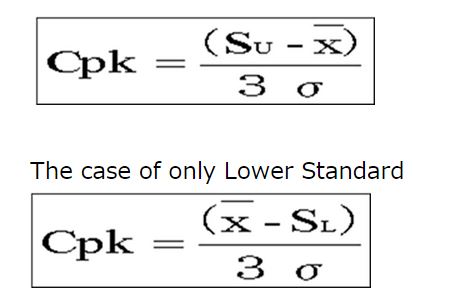
What is Cpk?
The Cpk is used when average value and median of standard value is different
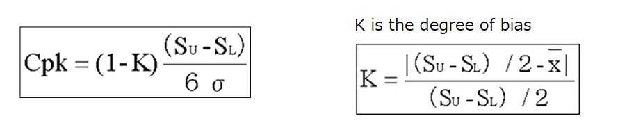
3)Cpk of One side of standard