Pareto principle
The Pareto principle (also known as the 80–20 rule, the law of the vital few, and the principle of factor sparsity) states that, for many events, roughly 80% of the effects come from 20% of the causes.[1][2]
Business-management consultant Joseph M. Juran suggested the principle and named it after Italian economist Vilfredo Pareto, who observed in 1906 that 80% of the land in Italy was owned by 20% of the population; he developed the principle by observing that 20% of the pea pods in his garden contained 80% of the peas.[2]
It is a common rule of thumb in business; e.g., “80% of your sales come from 20% of your clients”. Mathematically, where something is shared among a sufficiently large set of participants, there must be a number k between 50 and 100 such that “k% is taken by (100 − k)% of the participants”. The number k may vary from 50 (in the case of equal distribution, i.e. 100% of the population have equal shares) to nearly 100 (when a tiny number of participants account for almost all of the resource). There is nothing special about the number 80% mathematically, but many real systems have k somewhere around this region of intermediate imbalance in distribution.[3]
The Pareto principle is only tangentially related to Pareto efficiency, which was also introduced by the same economist. Pareto developed both concepts in the context of the distribution of income and wealth among the population.
In business
The distribution is claimed to appear in several different aspects relevant to entrepreneurs and business managers. For example:
80% of your profits come from 20% of your customers
80% of your complaints come from 20% of your customers
80% of your profits come from 20% of the time you spend
80% of your sales come from 20% of your products
80% of your sales are made by 20% of your sales staff[9]
Therefore, many businesses have an easy access to dramatic improvements in profitability by focusing on the most effective areas and eliminating, ignoring, automating, delegating or retraining the rest, as appropriate.
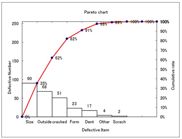
What is Pareto chart?
A Pareto chart, named after Vilfredo Pareto, is a type of chart that contains both bars and a line graph, where individual values are represented in descending order by bars, and the cumulative total is represented by the line.
The purpose of the Pareto chart is to highlight the most important among a (typically large) set of factors. In quality control, it often represents the most common sources of defects, the highest occurring type of defect, or the most frequent reasons for customer complaints, and so on. Wilkinson (2006) devised an algorithm for producing statistically based acceptance limits (similar to confidence intervals) for each bar in the Pareto chart.
*Qutote From Wikipedia
——————————————————————————————-
How to create a Pareto chart?
Sample Pareto chart Excel File→pareto chart
1.Open Failes name “Pareto chart”
2. Input items and the number
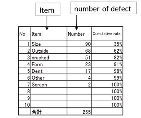
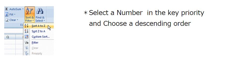
3. Sort Item
Sorted in descending order, the number of defect
1)Choose a selection
2)Choose Data of menu bar → Sort
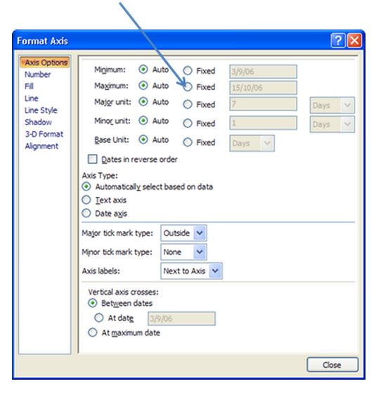
4.Fix Y-axis
Choose Fixed and Input Max of Number