Control Chart
What is Control Chart ?
Control charts, also known as Shewhart charts or process-behavior charts, in statistical process control are tools used to determine if a manufacturing or business process is in a state of statistical control.
If analysis of the control chart indicates that the process is currently under control (i.e., is stable, with variation only coming from sources common to the process), then no corrections or changes to process control parameters are needed or desired. In addition, data from the process can be used to predict the future performance of the process. If the chart indicates that the monitored process is not in control, analysis of the chart can help determine the sources of variation, as this will result in degraded process performance.[1] A process that is stable but operating outside of desired limits (e.g., scrap rates may be in statistical control but above desired limits) needs to be improved through a deliberate effort to understand the causes of current performance and fundamentally improve the process.[2]
The control chart is one of the seven basic tools of quality control.[3] Typically control charts are used for time-series data, though they can be used for data that have logical comparability (i.e. you want to compare samples that were taken all at the same time, or the performance of different individuals), however the type of chart used to do this requires consideration.[4]
Chart details
A control chart consists of:
Points representing a statistic (e.g., a mean, range, proportion) of measurements of a quality characteristic in samples taken from the process at different times [the data]
The mean of this statistic using all the samples is calculated (e.g., the mean of the means, mean of the ranges, mean of the proportions)
A centre line is drawn at the value of the mean of the statistic
The standard error (e.g., standard deviation/sqrt(n) for the mean) of the statistic is also calculated using all the samples
Upper and lower control limits (sometimes called “natural process limits”) that indicate the threshold at which the process output is considered statistically ‘unlikely’ and are drawn typically at 3 standard errors from the centre line
The chart may have other optional features, including:
Upper and lower warning limits, drawn as separate lines, typically two standard errors above and below the centre line
Division into zones, with the addition of rules governing frequencies of observations in each zone
Annotation with events of interest, as determined by the Quality Engineer in charge of the process’s quality
X-r Control Chart Excel File→x-r control chart
pn Control Chart Exce lFile→pn control chart

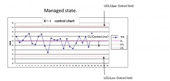
Line control limits(UCL,LCL) are calculated by a predetermined formula(3σ way)
Probability that deviates from the control limit is 0.3%.
In other words three to produce 1000 units
3σway CL(CenterLine) Average
UCL(Uper Cntrorl limt) =Average+3×σ’
LCL(Lper Cntrorl limt) =Average-3×σ’
state is outside the control limit line and then state is abnormal
8 successivevalues on sameside of Centerline→state is abnormal
The purpose of the control chart
There is a control chart for analysis and control
Aanalysis・・To investigate process
Control・・To keep the quality
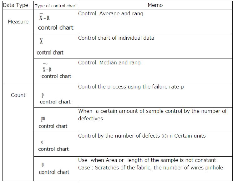
Type of control chart
Creating Xbar-R control chart
Step1 Collect the data
Step2 Grouping Data
Step3 Calculates the average value of the data in each group
Xbar=The total sum of the data of each group/Number of samples in group
Step4 Calculate the R range of the data of each group
R=The maximum value in the group(MAX)-(MIN)
Step5 Calculate the total average value.
total average = sum of the average value of each group /The number of groups
Step6 Calculate the average value of the range R
Average value of R range= total value of R for each group /Number of groups
Step7 Calculate the control line
Xbar control chart R control chart
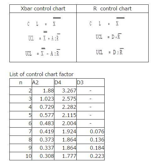
Step8 Draw control limit line
Step9 Plot the average Xbar and Range R then then to polygonal line
The point of view of control chart
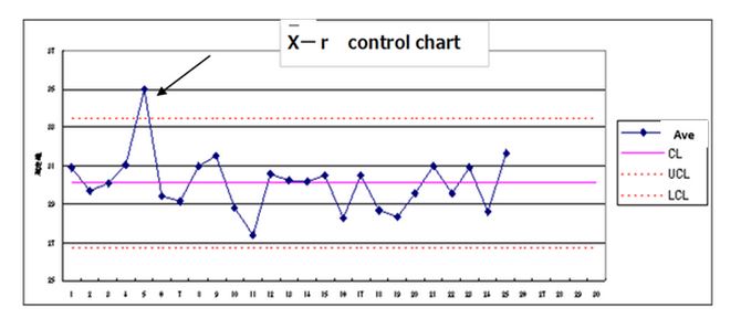
①Cases outside the control limit line and On line
Judge an abnormality has occurred in the process
Measures to prevent quickly
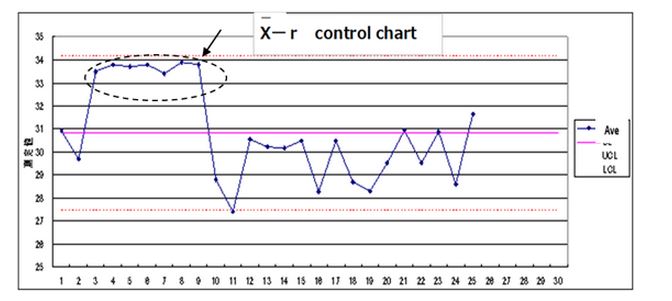
②When the plot more than 7 points
Judge an abnormality has occurred in the process
Measures to prevent quickly
③Tend
When the point is continuously rising and falling that called the tend
Measures to prevent quickly
④Periodicity
Investigate the cause of the periodic
Notes on the use of control charts
1)Do not confuse the standard value line and control limit line.
2)Error of judgment in the control chart
Error of the first kind(Eerror of Hasty person)
Judged to be abnormal, but not in an abnormal
Error of the second kind(Eerror of Idly person)
We do not notice abnormal to have occurred
Control limit lines set the standard deviation at the three-fold
*Quote From Wikipedia